Project overview
MovieGo in an upcoming movie theater franchise that plans to start expanding in selected states of the USA. MovieGo strives to deliver a next-level moviegoing experience. MovieGo targets people from all different ages but focus specifically in young adults and mature people.
The goal
Design an app for MovieGo that allows users to purchase movie tickets and food easily and quickly.
The challenge
It’s too inconvenient to buy movie tickets in person and websites or existing apps are complicated to use
User research

I conducted interviews and created empathy maps to understand the users I’m designing for and their needs. A primary user group identified through research was older adults that are not very familiar with apps and that have sight problems.
Research also revealed the fact that people didn’t use apps because of how annoying they can be with some examples being, loading times, size of components, colors, complexity and more.
Pain points
1
Time
Working adults didn’t have enough time to explore the app and learn how it works.
3
Accessibility
Most platforms are not accessible for different people, like spanish speaking, font sizes, colors…
2
Familiarity
Some working adults are not very familiar with technologies, so they don’t know hot to order online.
4
IA
A lot of apps don’t have displayed all the necessary information the user needs at the time.
Meet the users

PRIMARY
NAME: Allin
AGE: 38
OCUPATION: Professor
Allin is a very passionate woman that loves her field of study and profession. She also loves her child and loves to spend as much time as possible with them. Since she works very long hours she is often very tired and doesn’t want to deal with annoying tasks. She likes taking her child to the movies but she’s usually too tired to deal with the inconvenient process of booking a seat. Her sight has started to become weaker so she uses accessibility tools like zoom or readers to help with it.

PRIMARY
NAME: Allen
AGE: 52
OCUPATION: Small business owner
Allen has been a very hard-working individual since he was a young child. His father passed on to him the family business when he was 18 and he has been managing it ever since. Due to it, he never went to college and doesn’t like to use technology. He has a very basic smartphone because his family got him one but he doesn’t use many apps. He just wants to spend time with his family and he wants to take them to the movies as fun surprises but doesn’t know how to do that. Due to this he wishes to have an app that can do that as easy as possible.
Handmade wireframes

Digital wireframes
For the wireframes it was imperative to have certain features and focusing on solving the pain points I found on my research.
For the first iteration we went for a clean design that included modern looks and all the information the user wanted and break down all the process the user needed to complete in easy to digest separate steps.
As the initial design phase continued, I made sure to base screen designs on feedback and findings from the user research.

As the user flow continued, it was a priority to make the design as simple and clean as possible.

I was an important focus point to keep all the relevant information for the user at a glance, so I designed the consistent information panel.

For our food screen, it was decided to keep a similar format for promos, but I decided for something more similar to food ordering apps so users would be familiar with the navigation.

Low-Fidelity prototype
Using the completed set of digital wireframes, I created a low-fidelity prototype. The primary user flow I connected was selecting a movie, so the prototype could be used in a usability study.

First round of findings
I conducted two rounds of usability studies. The first usability study used a low-fidelity prototype and it involved 8 participants from different backgrounds. Findings from the first study helped guide the designs from wireframes to mockups. I observed three particular challenges that needed to be overcome.
Size of elements
After the first round of usability studies, it was observed that participants had trouble selecting some elements, particularly the seats they wanted to reserve.

Location button
The second challenge that needed to be overcome was that participants didn't see the point in having a button on the homescreen that allowed them to change city location quickly.
Visual cues
The last main challenge that I faced was that many participants didn't understand when an element was interactive or not, so sometimes they didn't know they had to press an element to change screen.

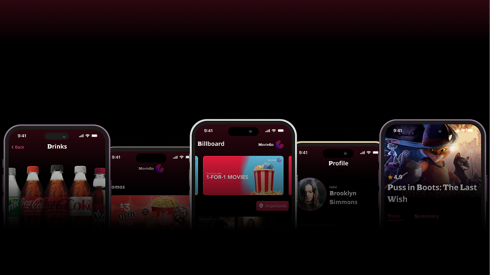
Mockups

Main flow

Food store flow

Profile & Customization flow
Second round of findings
The second usability study used a high-fidelity prototype and it involved 10 participants from different backgrounds. This prototype had fixed the biggest pain points revealed in the last study. The study revealed what aspects of the mockups needed refining. Although this study had a lot more positive feedback, there were a couple challenges that needed to be quickly addressed.
QR button are not noticeable
It was discovered how some participants missed the appearing buttons on the homescreen, especially the QR button.


CTA buttons are not accessible for everyone
There was a case where one participant had difficulty advancing to the next page because they didn't scroll down to see the CTA button.
More feedback needed
Some participants weren't sure that they had done something because there was not notable feedback, specially in changing the theater location.
Iteration
After the second round of usability studies I had the opportunity to refine details to make the UX more accessible and pleasant. This didn't involved heavy redesign, it was more of an "focus on the details" phase. As seen, the first changes were directed toward the main pain points from the second study. After that, I focused on other quality of life changes.


High-Fidelity prototype
The final high-fidelity prototype presented clean and full of information screens, plus an easy to follow flow for ordering food or seats while still meeting user’s expectations of it being easy, quick and informed to use.

Sticker Sheet

Interaction sheet

Color palette

Accessibility considerations
1
Readability
Provided text & imagery big enough to be read without any problems.
2
Visual cues
Used icons, imagery and motion to aid users and make the design as friendly as possible
3
Assistive tools
Provided the ability to add alt text for screen readers or gestures like pinch to zoom, high contrast mode or language selection for people that need it.
Takeaways
The app makes it so easy for users to meet all their movie-going needs, whether that is ordering tickets, ordering food, checking the upcoming movies and more.
Users were surprised how easy it was to use and understand, even users that didn’t use apps found it very easy to use.