
Yeltic Learn
PROJECT:
Yeltic Learn Redesign
ROLE:
Product designer
DURATION:
6 weeks
SLIDE DECK
Some of the final screens
Project overview
Yeltic Learn is an app that will help train the workforce for the future of work, making use of diverse technologies, like augmented reality, virtual reality, simulators, 3d interactions, and more. The app will help with hard skills like specific trainings required for specific roles, as well as soft skills to help the worker increase their productivity, confidence, ability to collaborate, and more.
The way this app accomplish this goal is through 2 main type of content, the first one is a small educational capsules called Nanos. These capsules take around 15 minutes or less to complete and they test the user on what they just learned. The second one is called Learning Paths (Rutas de aprendizaje) and the simplest way to explain this is to imagine it as a group of nanos with a pre-planned sequence for more specialized training.
Problem to solve
At present, the existing app interface and information architecture do not align with user-friendly standards. It exhibits a deficiency in various design principles, such as negative space, margins, and guidelines. The app's primary emphasis has shifted, resulting in users feeling inundated with information and a sense of overwhelm.
Goal
Make the redesign of Yeltic Learn as user-friendly as possible with a familiar and fresh design while keeping the education elements, and adding needed features for the current users. The goal needed to be completed in 4 weeks to meet MVP deadlines.
Background
Upon the app's pilot test release and the subsequent realization that the product was not user-friendly, I transitioned from my initial team to join this new team, tasked with addressing the many issues that the app was facing.
The old look was described by many users as “too black”, “too boring”, “too confusing”, “too ugly”, and more. A redesign was necessary if the company wanted to keep their users.
In the following screenshots you will be able to see what the old design looked like and why it needed a change. There are a lot of points to highlight, with the most important pain points being the lack information architecture. Elements feel crowded and everything looks bloated.
Users commented on how everything is very hard to locate, and how they don't really understand how to interact with the app. They commented on the design being to hard to read logically and that there's a lot going on at the same time.
Main pain points
01
The product and user flow are very complex and don't dedicate a lot of space to just let the users breathe and process their actions. There are many steps for every action and it can get confusing to know where you are.
02
The lack of negative space made everything very hard to scan, since there was no visual space between elements, users couldn't recognize the common region aspect of many things, making them confused.
03
Although the app has a very high contrast ratio on colors, it fails to comply with many accessibility guidelines. Some of these problems were the lack of perceivable elements, font size, data entry, or inconsistent layouts and navigation.
04
The information architecture was another big problem on the app. There were no real guidelines to it, and as such, many users couldn't find what they were looking for most of the time.
Meet the users

PRIMARY
NAME: Andrea
AGE: 43
OCUPATION: Assistant
Andrea is a 43-year-old woman that works as an assistant doing many different tasks in the office. She didn’t finish highschool and she works long hours from monday to saturday. After working foe more thn 20 years in an office her sight is getting very weak and as such she has trouble with small screens.
When testing yeltic learn she didn’t know where to go or how to do anything. It was very difficult to read anything and didn’t have the time to discover how to do it because she is very tired after work.

PRIMARY
NAME: Alejandra
AGE: 23
OCUPATION: Accountant
Alejandra is a 23-year-old accountant graduate that has been working at the company for only 2 years. She is very hardworking and she is always trying to prove that she is capable of implementing new technologies to help the company’s workflow.
When she tried yeltic learn she didn’t really understand the app, she had many frustrations and claimed that it didn’t was well laid out. Some of the problems she had was that the app didn’t look particularly good, it was too gray, she also didn’t like that it look way too bloated and that there were too many steps to follow but the experience was boring.
Handmade wireframes
A step I decided to take before the handmade wireframes was to take a look, not only at our competitors, but also to some other big apps that had proven patterns. The two main categories I went to for reference were educational apps and streaming apps.
The thing I wanted to understand on the educational apps was the language they use, the way they present their big courses and smaller courses/certificates, as well as how they reward learning and how they evaluate the user. As for why I also focus on exploring streaming apps, it's because they are really good at keeping their users in their app through exploration of media and content.
The main things I learned and wanted to implement were:
01
The need for a visual difference for the elements that are going to populate our home screen, this includes the nanos, learning paths or the different categories.
02
The language needs to be related to education so it doesn't feel like an streaming app. This means that titles, descriptions and content need to have a certain level of formality.
03
Images need to be attractive enough to make the user want to click on the content, but also it needs to feel grounded so people can relate to it.
04
We need to put our focus into the new gamification system so it feels fresh and engaging among users, but also rewarding when completing capsules alone.
You can see some of this ideas implemented in the following wireframes.
User flow

Sitemap

Digital wireframes
For the wireframes it was imperative to have certain features and focusing on solving the pain points I found on my research.
After having the wireframes approved I started going for the ideated design, having it look clean so it's not hard to navigate through but at the same time being attractive and having all the necessary information was the second priority.
Home
In the initial phase of the project, my aim was to completely revamp the app, commencing with a comprehensive redesign of the Home Screen. The previous incarnation of the Home Screen served no purpose.
When approaching the design of the Home Screen, my objective was to captivate users, encouraging them to delve into the app's offerings without feeling overwhelmed.
I opted for a modern design strategy that emphasized prominent images over an abundance of text. This choice was made to enhance the app's allure and promote exploration through visually engaging imagery.
The Home Screen predominantly features images, accompanied by pertinent information for each content piece, such as the content title and later, the duration (later changed to duration).

Profile
The whole idea behind the redesign was to make the app feel like it's an extension of you. That's why we really thought about where everything should go.
On the profile screen, we decided to put all the fun stuff like leaderboards, challenges, and stats. We did this to give you that feeling of ownership and to have the user reach here to do everything related to them.

Content
Another significant shift in the app's evolution involved the establishment of a fresh screen dedicated to immersing users into the content.
Previously, the design relied on a compact overlay popup to convey a substantial amount of information. However, the redesign, informed by research findings, dictated the use of the entire screen to accommodate all the information.
On this page, a greater emphasis is placed on visuals over textual content, while also aiming for a clean and attractive design. Although certain elements evolved during the iterative process, the underlying design philosophy remained the same throughout.

Stats
The ultimate significant aspect that underwent transformation was the statistics feature. Initially, it occupied the same space as the profile, with all profile-related content situated within the settings. To align more closely with numerous other apps and provide a sense of familiarity to our users, I opted to revise this arrangement. As a result, the user's progress now resides within a menu on their profile.
The stats page furnishes users with pertinent information, enabling them to monitor their learning progress and app utilization. The underlying goal of this concept is to empower users to manage their learning journey and customize it according to their individual requirements.
Furthermore, this page provides smart analysis, delivering users not only with relevant insights but also identifying areas in need of improvement and notifying them accordingly.

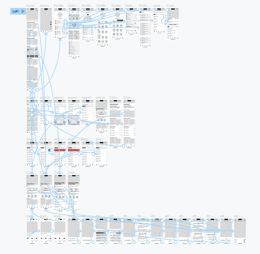
Low fidelity prototype
Using the completed set of digital wireframes, I created a low-fidelity prototype. The starting user point was the home screen and it was ready for the first round of usability studies.
Gamification (New system)
In the previous design, the XP held no functional significance. Therefore, for the redesign, it became imperative to establish a new gamification system that not only incentivizes users but also fosters a positive spirit of competition.
The new system consisted in the following mechanics.
01
Implementation of a leaderboard that can be weekly, monthly or all time and displays the names of the employees that gathered the most amount of XP.
02
Creation of a diverse challenges system. This system rewarded users for completing different tasks inside the app. The challenges could be seasonal, daily challenges, technical, and more.
03
Level progression system so users don't feel static or stuck in the same place while using the app. With this system users will recognize that they are always progressing towards a goal.
You can see some high-fidelity examples of these system in the following image.


Usability studies: Round 1 (2 weeks into project)
I completed two sets of usability assessments, which yielded valuable and intriguing insights. The primary outcome of the initial usability study was an enhanced understanding of user preferences for specific features. During this process, I identified three distinct obstacles that required resolution.
01
Users expect to see certain features like playlists on their home screen.
02
Some users missed the name of certain sections making them confused.
03
Users didn't like a feature proposed by a stakeholder and as such, it was removed.
Mockups 1.0
Home - Before redesign
The previous layout included a large hero carousel showcasing various featured content. However, a significant issue arises because the additional content at the bottom of the screen isn't easily visible. The extensive carousel at the top, coupled with the absence of visible content without scrolling, hinders the screen's ability to encourage exploration.
Home - After redesign
In the redesign, I opted for a more minimalist approach. The primary objective was to achieve a clean and slightly vibrant appearance – not overly bold, but infused with a touch of color.
The second major alteration pertained to the featured content. Rather than a carousel, we chose to spotlight one piece of content at a time to encourage exploration. Its dimensions were scaled down to allow users to view additional content effortlessly.
Furthermore, we introduced filters to enhance the ease and dynamism of exploration. This ensures that users only encounter the content they're interested in seeing.


Home - Before redesign
The content within the carousels underwent significant transformation. As evident in the previous design, these carousels lacked a coherent structure. They appeared cluttered and lacked uniformity amongst themselves. The images had an awkward aspect ratio, the titles were inadequately sized and lacked clear contrast, certain icons were accompanied by labels while others were not, resulting in an overall suboptimal visual presentation.
Home - After redesign
In the redesign, I emphasized the images significantly, aiming to position them as the focal point of the screen to captivate users' attention. This entailed allocating more screen real estate to the images, enhancing their visual appeal in the process.
We enhanced the visibility of each content capsule's title and introduced a secondary row of information indicating the content's category (this will change later).
Lastly, we expanded the space for each carousel, creating a more open and serene design aesthetic.


Settings - Before redesign
The settings screen didn't necessitate extensive revisions; instead, my focus was directed towards enhancing semantics, restructuring hierarchy, and implementing visual adjustments, which constituted the primary areas of improvement.
Settings - After redesign
The most notable transformation pertained to the visual aspects. Stakeholders expressed a strong desire to align more closely with the iOS aesthetic, making this a significant focal point for both the settings and profile sections.
The second major alteration involved transitioning from a design that displayed all elements to one that categorized each setting option and relocated them to a separate screen. This strategic shift allowed us to achieve a cleaner and less overwhelming appearance, contributing to a more user-friendly experience.


Profile - Before redesign
This screen underwent the most significant overhaul, primarily because it had been a source of confusion and user frustration. In the previous design, this statistics dashboard was nested within the profile category. Consequently, users attempting to modify or personalize their profiles were unexpectedly confronted with statistics and numerical data, leaving them unsure about the appropriate actions to take.
Profile - After redesign
When planning the redesign, it was evident that a clear distinction between the profile and statistics was essential. Extensive research and a thorough review of competitors' approaches ultimately led to the conclusion that the optimal strategy was to incorporate statistics as a subcategory within the broader profile category.
Consequently, this screen now encompasses subcategories such as statistics, notifications, settings, legal information, help center, and other related options. By organizing elements into these distinct subcategories, we have effectively moved away from concentrating all settings and external links solely within the settings screen. This approach ensures that everything is thoughtfully arranged in familiar sections, enhancing user comfort and ease of navigation.


Nanos and learning paths - Before redesign
The method through which users accessed content such as nanos or learning paths was highly impractical. Instead of merely redesigning it, a comprehensive overhaul was imperative.
In the initial image, you can observe that the title is being cut off, the thumbnail possesses an awkward aspect ratio, rendering the image difficult to appreciate. The textual elements appear cramped, the iconography appears disjointed, and the tags at the bottom are visually unappealing, among other issues. Consequently, I abandoned the old concept of an overlay entirely and opted for an entirely fresh approach.
Nanos and learning paths - After redesign
I decided that a full screen preview was necessary to keep the idea of incentivizing users to explore the app and discovering everything it had to offer.
The design has a modern and appealing vibe, incorporating diverse elements that spotlight the product's strengths and distinctive attributes. These include showcasing the various technologies employed in the content, providing pertinent details such as duration or a comprehensive description, outlining the sequence of nanos constituting a learning path, and offering suggestions to encourage further exploration of additional content.


AR content - Before redesign
The previous design exhibits numerous fundamental issues, such as the sudden introduction of a hamburger navigation or the confinement of extensive dialogue within a cramped bubble, devoid of a discernible path for progression or regression.
AR content - After redesign
Revamping the AR view was among my topmost concerns, aiming to maximize screen space for users to genuinely immerse themselves in the content. My goal was not only to achieve a seamless immersive experience but also to establish clear directives for the presentation and functionality of essential information. Additionally, I focused on delineating user interactions and navigation within their nano, ensuring a cohesive and well-defined approach.
The principal alteration entailed the introduction of an interactive card. This card serves as a hub for information and navigation components, dynamically adjusting in size based on the volume of content it holds. This change effectively resolved the screen space constraint.
In terms of the header, I streamlined it to occupy a single row of text. with it scrolling automatically when users touch it. The reason behind the interaction is to not distract the user with movement while they are immerse in their content.
To simplify navigation, I opted for two buttons instead of a hamburger menu. One button closes the content, while the other provides access to various settings options. This approach streamlines the process of exiting content and optimizes user efficiency.


Key mockups for the app 1.0
High fidelity prototype
The mockups were ready and the navigation was adjusted in accordance to the results of the previous usability studies, so it was time to create a fully high-fidelity prototype and see how the users reacted to it. The following link will direct you to the newest version available of this product.

Usability studies: Round 2 (4 weeks into project)
The follow-up usability studies yielded positive results, prompting me to implement the necessary adjustments before analyzing if the app required heavy changes or if it was ready for its first MVP. The primary insight from this round of testing revolved around the phrasing of specific elements, rather than issues related to navigation or design cohesiveness. The following were the main patterns that were found.
01
Users exhibit a desire for an additional alert preceding the execution of irreversible actions.
02
Users had trouble understanding certain concepts for their given name.
03
There's a healthy percentage of participants using filters or shortcuts, but many still choose to explore the app.
Iteration 1.0 (4 weeks into project)
Following the completion of the second round of usability studies, it became apparent that the necessity for further iterations would be minimal. A significant portion of the iteration process pertained to refining and selecting appropriate wording and nomenclature for various elements. The most substantial alteration in the design was the introduction of a secondary cautionary prompt for irreversible actions, accompanied by the incorporation of more pertinent graphical representations within users' statistics.
Gamification
It was decided to push the gamification for the third MVP, so the removal of those screens and menus subcategories were ordered.

More relevant info
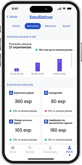
In this particular phase of iteration, users expressed a keen interest in obtaining a comprehensive overview of their progress across various learning abilities offered by the app. To fulfill this user requirement, a strategic enhancement was implemented by integrating a radar graph.
This thoughtful addition was aimed at seamlessly presenting users with a visual representation that allows for effortless and intuitive assessment of their advancement in different learning domains. The incorporation of the radar graph not only addresses users' specific needs but also contributes to a more engaging and informative user experience within the app's interface.
The next significant alteration involved splitting the stats page into two distinct sections: one focusing on the user's progress and the other dedicated to usage statistics. The former centers around the user's interaction with their learning activities, while the latter delves into their engagement with the app itself.

Second chance
In the third round of iterations, a notable modification was introduced, entailing the incorporation of an additional precautionary step before deleting downloads.
Users will now receive a written advisory notifying them that upon deletion, they will need to re-download their content. This enhancement serves to further bolster security measures and user awareness.


Iteration 2.0 (6 weeks into project)
Following the completion of the initial MVP, my responsibility entailed revisiting the app to implement the changes I deemed essential due to the fact that the product was having a slight direction change. With a two-week timeframe at my disposal, I concentrated my efforts on effecting visual enhancements and implementing minor architectural adjustments. My intention was not solely to enhance the app's visual appeal but also to achieve a heightened sense of cohesion and trending aesthetics. Hence, I dedicated these two weeks to diligently pursue this objective.
My attention was directed towards refining iconography, optimizing spacing, streamlining minor user pathways, and presenting information that aligned seamlessly with the slightly adjusted direction the app was embarking upon.
I will explain the shift in the app's trajectory. Rather than existing as an independent product, the app will serve as an extension of the Yeltic Editor. Consequently, the transition entails a departure from in-house content creation, with all content being generated by the respective companies through the editor.
Despite this significant shift, the impact on the design remains relatively minimal. I made necessary adjustments where required, allocating the remaining time to primarily concentrate on enhancing the visual aspects.
Home
The home screen suffered very minimal architectural changes, its biggest changes were visual, like increasing the contrast for the second row of information in the carousels. The other changes were:
-
Since the content is departing from in-house content to user-produced content, the categories went from abilities to a broader focus like trainings, learning paths, capsules, and evaluations
-
The chips changed their style to make them more visually appealing and also what they will display in compliance to the new way of categorizing items.
-
Instead of featuring the category in the secondary row of each content, our choice was to exhibit the duration instead. This alteration stems from the capability of Yeltic Editor users to construct custom carousels and assign appropriate names. This adjustment became imperative to prevent redundancy and enhance the overall user experience.

Nanos & Learning Paths
Upon reengaging with the project, my primary focus was on reclaiming valuable screen real estate to facilitate users in swiftly obtaining pertinent information at a glance. Simultaneously, I aimed to augment functionality while streamlining the process for certain actions.
-
A substantial enhancement was made in content rating, reducing the interaction from two clicks to just one, similarly streamlining the process of altering ratings.
-
An array of additional actions was introduced, all of which have been thoughtfully transformed into badges nestled within a scrollable carousel. This design approach not only imparts a contemporary appearance but also contributes to an enriched and functional interface.
-
To reclaim precious screen space, the download button was repositioned from its original location and seamlessly integrated within the badge carousel. This strategic adjustment enabled us to recoup lost space while maintaining an efficient user experience.


More powerful interactions and better architecture
The following changes affect both the Learning Paths and nanos, except for the one that is exclusive to Learning Paths. The focus for this screen was to improve the way we presented the list of nanos to make them more interactive and useful. Some other minor changes were implemented to allign with the new direction the app was taking.
-
The list of nanos are more functional than ever, they now do different actions depending on where the user clicks. Their design change to make them more informative and to give the user more relevant info. Some of the changes were: Status (download/downloaded), click on the middle to reveal the description, click on the thumbnail to start the content, click the kebab to reveal secondary actions, see their duration and your progress (Not started, in progress, or completed), and more. (Exclusive to Learning Paths)
-
Instead of having two set of categories for the technologies and using two rows, I decided to simplify everything into one set of info and only using one row that is scrollable
-
You can save as favorite or have secondary actions at the top of the screen ()
-
Completed label now goes over the title of the content


Iteration 2.0 - General changes (6 weeks into project)
I wanna use this space to talk about all the general changes that took place but don't need to be super specific, and also some flows that are new.
General changes
-
Content inside learning changed its style to align more with how we present it inside the Learning Paths we just talked about. Though similar, they offer slightly different information related to them. For lessons they display the duration and for evaluations they display the grade. (Image 1-2)
-
The profile page now features the ability to show the user's status (online/offline) in preparation for the gamification features. (Image 3)
-
All the modals for irreversible actions now look completely different to the old card design. This is to make it easier for the user to know the importance of certain actions. (Image 4)
-
As mentioned before, the 'Completed' label now lives above the title of the content. (Image 5)
-
The glossary changed its design slightly to further align with the new look. (Image 6)
-
The learning paths' cards now featured a new look to further align with the new look. (Image 7)
-
Screens like: learning, my progress, about Yeltic, now featured a new look for their tabs. (Image 8)
-
Audio player improves the size of different buttons, removes functionality that won't be added and changes position for queue button. (Image 9)
New flows
-
Splash screen look was updated to further align with new look (Image 1)
-
Recover password flow was created. (Image 2)
-
Update profile picture flow was created. (Image 3-4)
-
Update profile information flow was created. (Image 5)
-
Selection between 360 image and AR flow was created. (Image 6-7)
-
Download content flow was revised. (Image 8)
-
Empty states for different screens were created. (Image 9-10)
-
Log out button added to the profile screen. (Image 11)
Some of the final screens v2.0
Component library
Accessibility considerations
In the extensive process of redesign, ensuring accessibility stood as a paramount focus. Our unwavering goal was to infuse the design with a comprehensive range of accessibility considerations, striving to strike a balance that resonated with the team's available timeframe and resource capacity.
Recognizing the importance of making the app inclusive and user-friendly for all, we endeavored to incorporate a robust suite of accessibility considerations that were realistically attainable within the given project deadlines and the team's operational capabilities.
This approach underscored our commitment to creating an interface that catered to a diverse user base while being pragmatic about the implementation of these enhancements.
01
Furnished text and imagery that were generously proportioned, meticulously catering to a size that facilitates comfortable and hassle-free reading and viewing, thereby eliminating any potential readability issues.
02
By integrating well-established and universally understood iconography, the aim is to facilitate effortless navigation and create a sense of familiarity for users as they interact with the interface.
03
Both color palettes and typography have been thoughtfully curated to adhere to the rigorous standards set forth by WCAG's AA guidelines, ensuring optimal accessibility and a user-centric design.
Takeaways
Impact
The redesign of this app has indeed yielded significant enhancements, primarily centered around its improved user-friendliness. Noteworthy progress has been made in various areas, including information architecture, design principles, and utilization of negative space.
The app has successfully undergone two rounds of usability testing, as well as practical implementation within a specific company, where valuable feedback highlighted a noticeable reduction in confusion during usage.
Embarking on this project marked a unique experience for me. Unlike my usual practice of starting projects from scratch, I was presented with an existing design framework that required substantial improvement. Despite the constraints of a predefined color palette and singular typeface, I am happy to have successfully transformed it into a functional solution that addresses users' needs effectively.
What I learnt
This project taught me the invaluable skill of working efficiently by navigating the delicate balance between comprehending the company's needs and revamping a non-functional product. Aligning my efforts with the existing flows and brand while accommodating necessary changes was indeed challenging, but it provided me with the experience of managing tight deadlines and effectively engaging stakeholders in collaborative discussions.
Next steps
01
Monitor the app and start the thinking process for the third MVP.
02
I am gearing up mentally for my upcoming project, which involves starting from a clean slate rather than a redesign. This shift necessitates acclimatizing to a more meticulous research approach, taking advantage of the extended timeframe at my disposal.